Process of Typeface Design – G
Documenting the Design Process of the Letter “G”
While many commercial fonts exist for alphabet styles such as Gothic and Mincho, making it common to base designs on those, brush-style lettering is rooted in Japanese and other Asian cultures, and as a result, there are very few alphabet fonts available in that style.
Therefore, when designing brush-style alphabet characters, it’s essential to take time and draw each form by hand from scratch. This creative process involves referencing a variety of existing letterforms and exploring possibilities through continuous sketching by hand—the act of drawing itself becomes the core of creation.
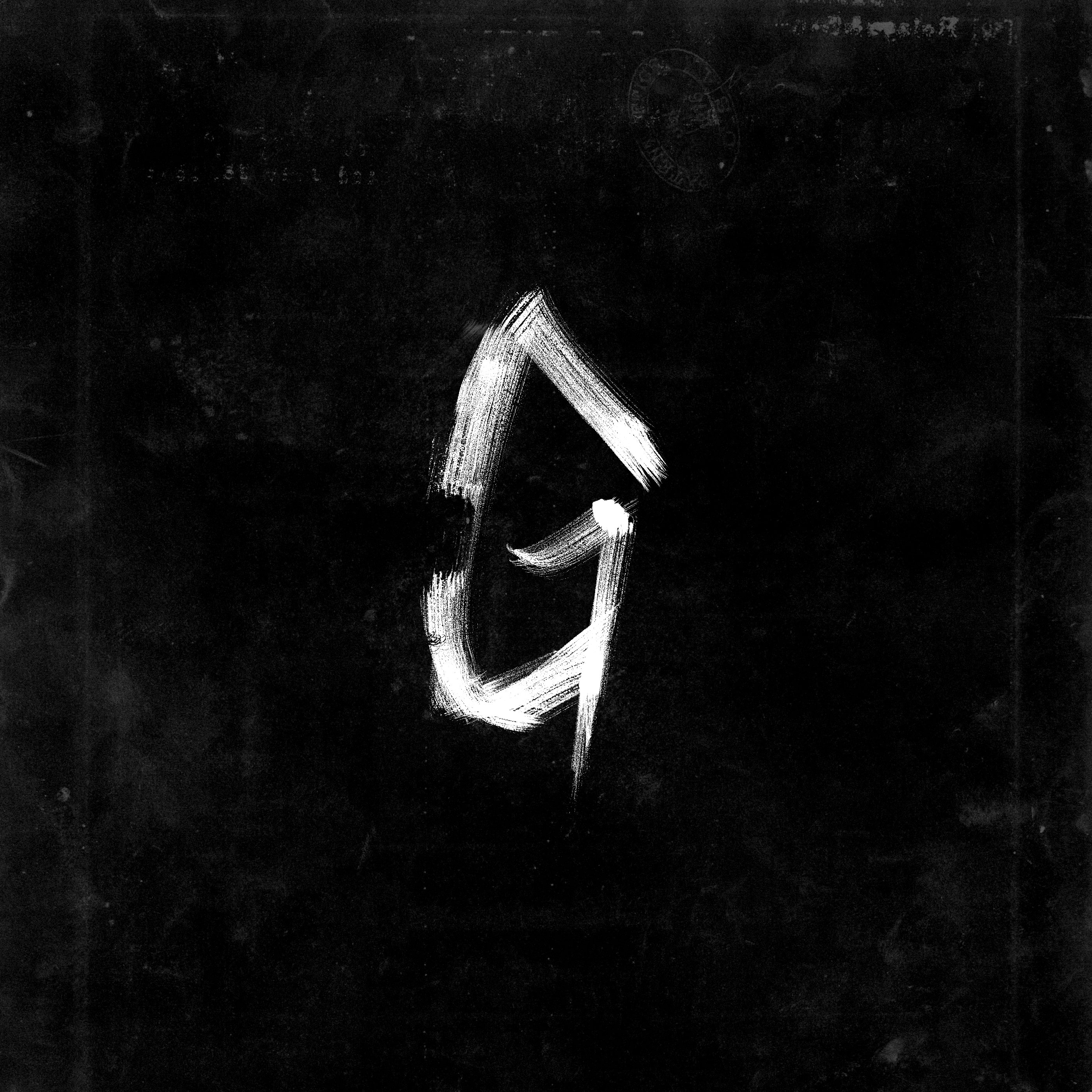
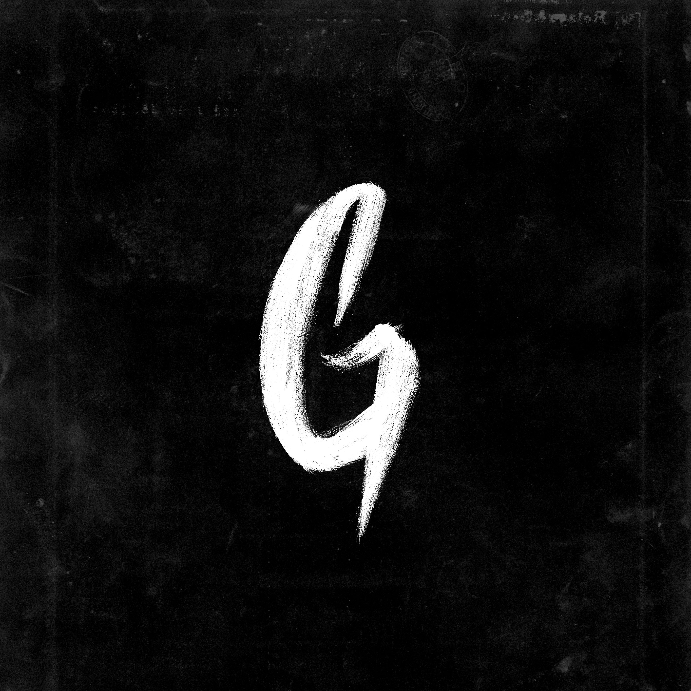
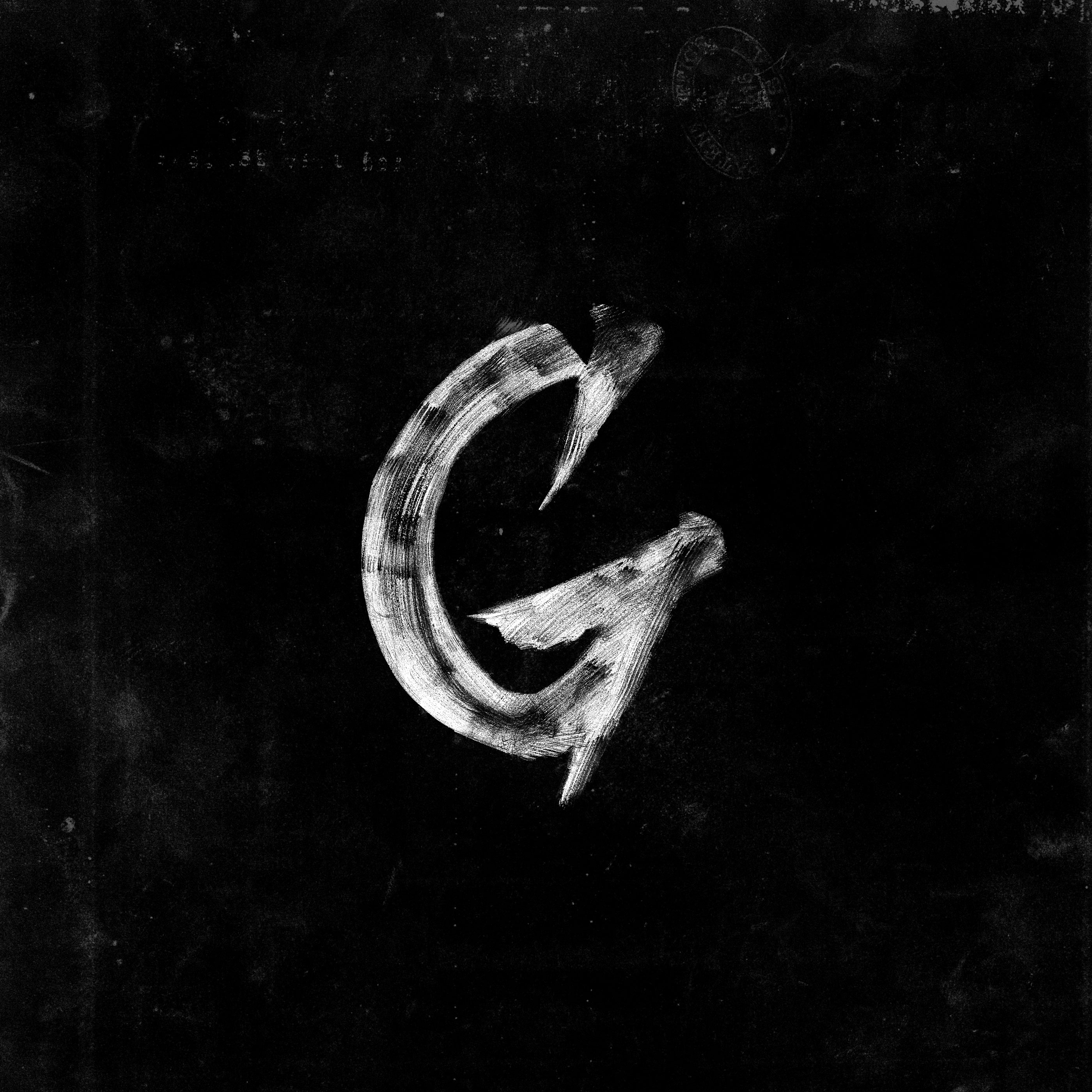
In designing the letter “G,” I repeatedly sketched out different forms, carefully observing the flow and rhythm of each line as it appeared on paper. These hand-drawn sketches were then digitized and refined further using design software, gradually bringing the letter to completion.
In the sketching phase, the raw strokes and traces of the hand remain vividly present, highlighting a unique beauty and energy that can only be found in the unfinished and the handmade. These are the moments that capture a sense of life and vitality often absent from fully polished fonts.
アルファベットのGをデザインする過程の記録
ゴシック体や明朝体などのアルファベット書体は、既に多くの商用フォントが販売されており、それらをベースにデザインする機会も少なくありません。しかし、毛筆体は日本やアジアの文化に根ざした表現であるため、アルファベットにおいては対応する書体の種類が非常に限られています。
そのため、毛筆体のアルファベットをデザインする際には、時間をかけて一から自分自身で手を動かして描いていく必要があります。様々な既存の文字や書体の形状を参照しながら、手描きで模索を重ねていく──このプロセスそのものが創作の核となります。
今回の「G」の制作においても、多くのスケッチを繰り返しながら形を探り、紙の上に現れる線の流れやリズムを確かめていきました。そうして生まれたスケッチは、パソコンに取り込んだ後、アプリケーション上でさらに細部を微調整し、完成へと近づけていきます。
スケッチ段階では、筆の勢いや手の動きがそのまま残っており、未完成ならではの荒々しさや即興的な美しさが際立ちます。それは、完成されたフォントにはない、生きた表情や力強さを感じさせてくれる大切な瞬間です。