
Luxury Japanese Supermarket
富裕層にむけた海外にオープン予定のスーパーマーケットのロゴデザイン
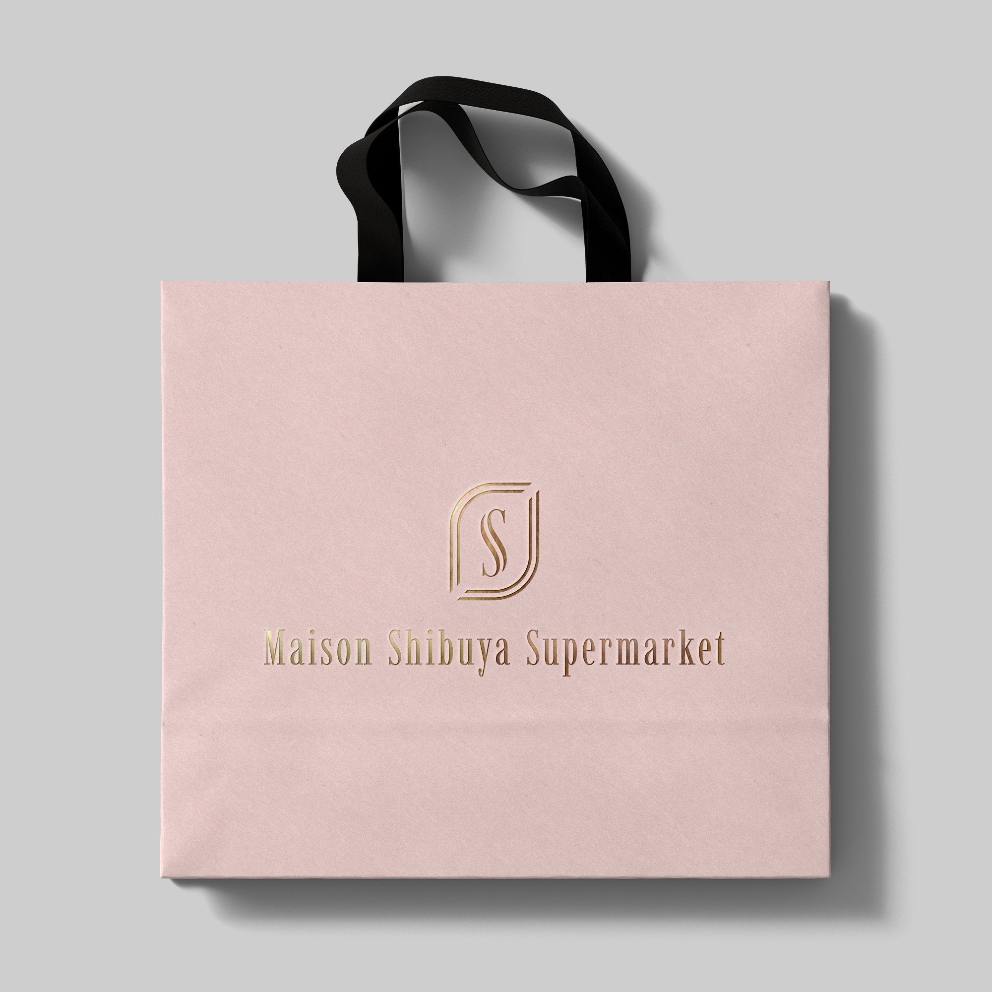
富裕層のお客様に上質な食体験を提供するスーパーマーケットのためにデザインされました。伝統的な日本の美意識と、現代の洗練されたデザインを融合させることで、単なる食料品店ではなく、暮らしを豊かにする特別な場所であることを表現しています。
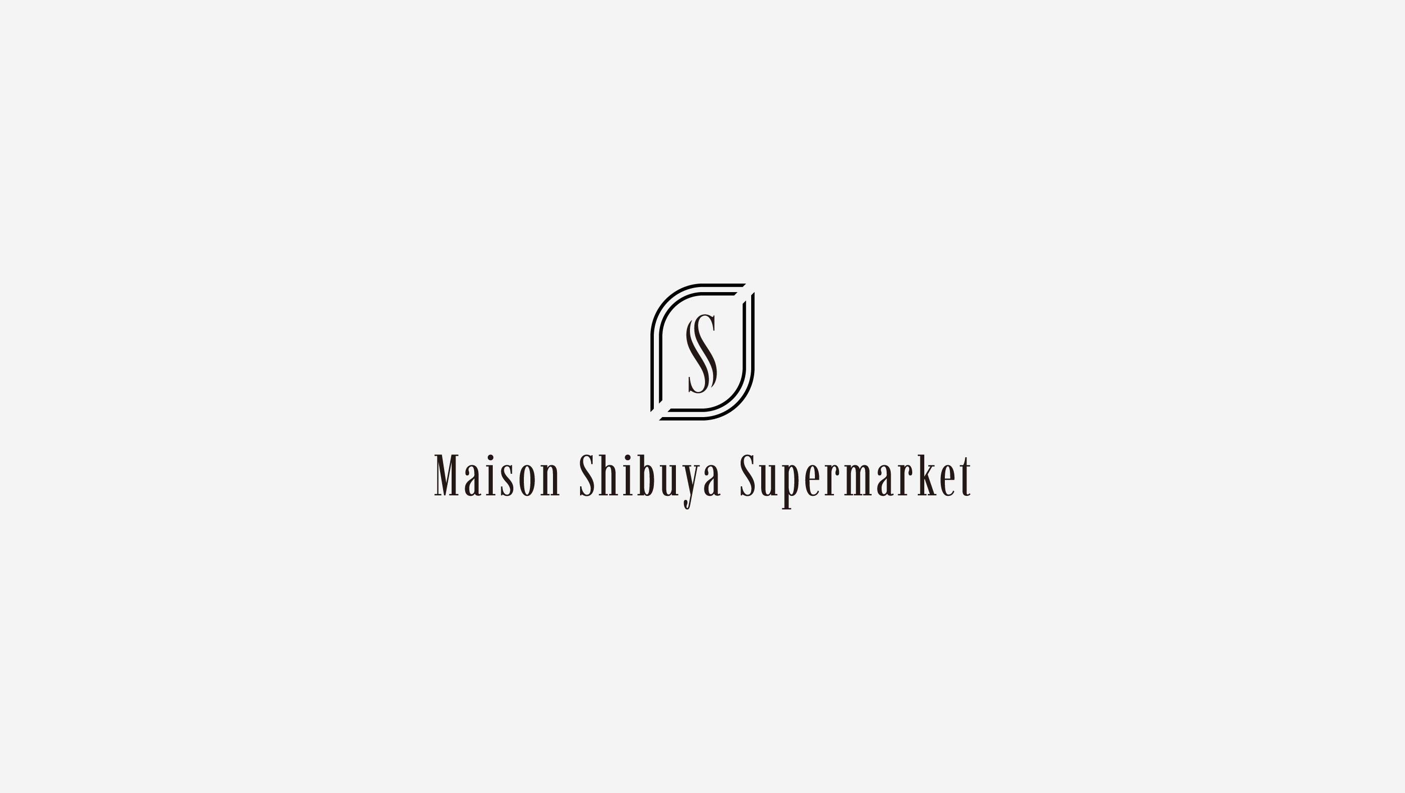
ロゴマークについてはクラシカルなモノグラムと現代的なラインを融合させたデザインです。「S」のモノグラムをベースにデザイン。「頭文字のS」と「Supermarket」の頭文字であると同時に、最高級を意味する「Supreme」の品質とサービスを追求する姿勢を示しています。二重のラインと線が途切れて空間が開けている箇所は「開かれた空間・店舗デザイン」と合致し、お客様をオープンなイメージで歓迎する姿勢を表現しています。普遍的な価値と歓迎の中での購買体験の提供でいるお店そのものを表現しています。
Maison(店・家)のように親しみやすく、かつ洗練された印象を与えることで、高級スーパーとしての高品質なイメージを表現しています。日本語と英語が混在するブランディングの中でも、国際的かつ都市的な印象を与えやすい書体です。
富裕層のお客様に上質な食体験を提供するスーパーマーケットのためにデザインされました。伝統的な日本の美意識と、現代の洗練されたデザインを融合させることで、単なる食料品店ではなく、暮らしを豊かにする特別な場所であることを表現しています。
ロゴマークについてはクラシカルなモノグラムと現代的なラインを融合させたデザインです。「S」のモノグラムをベースにデザイン。「頭文字のS」と「Supermarket」の頭文字であると同時に、最高級を意味する「Supreme」の品質とサービスを追求する姿勢を示しています。二重のラインと線が途切れて空間が開けている箇所は「開かれた空間・店舗デザイン」と合致し、お客様をオープンなイメージで歓迎する姿勢を表現しています。普遍的な価値と歓迎の中での購買体験の提供でいるお店そのものを表現しています。
Maison(店・家)のように親しみやすく、かつ洗練された印象を与えることで、高級スーパーとしての高品質なイメージを表現しています。日本語と英語が混在するブランディングの中でも、国際的かつ都市的な印象を与えやすい書体です。
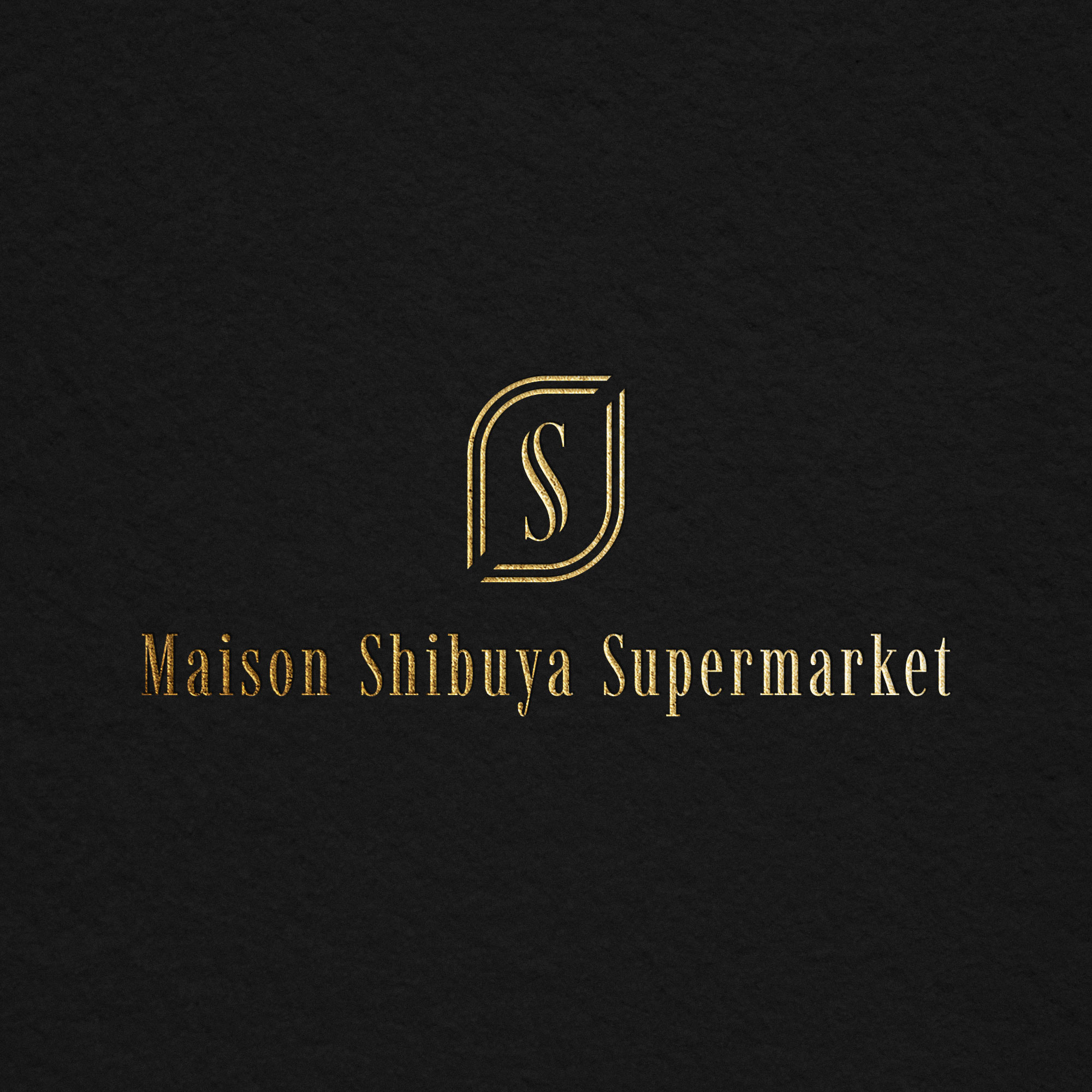
This logo was designed for a supermarket aiming to provide a superior culinary experience to affluent customers. By integrating traditional Japanese aesthetics with modern, sophisticated design, it expresses that the establishment is not merely a grocery store, but a special place that enriches daily life.
The logo mark is a fusion of a classical monogram and contemporary structural lines. It is based on the "S" monogram, which represents not only its initial but also "Supermarket," and "Supreme," signifying our commitment to pursuing the highest quality and service. The double lines and the deliberate breaks creating open spaces align with the concept of "open spaces and store design," expressing a welcoming attitude towards customers. It embodies the store itself by offering universal value and a pleasant shopping experience within a welcoming environment.
The design aims to evoke a familiar, home-like feeling, much like a "Maison" (house/shop), while simultaneously conveying a refined impression. This combination creates a high-quality image befitting a luxury supermarket. The chosen typeface is designed to give an international and urban impression, even with the blend of Japanese and English in the branding.