
MOBILE APP ICON DESIGN
本プロジェクトは、テニス愛好家向けモバイルアプリケーションのために制作された、ブランドの顔となるアイコンおよびロゴデザインです。私たちは、テニスの本質的な楽しさと、コミュニティがもたらす「繋がり」の価値を視覚的に表現することで、ユーザーに親しみやすさと同時に信頼感を与えるブランドイメージの構築を目指しました。
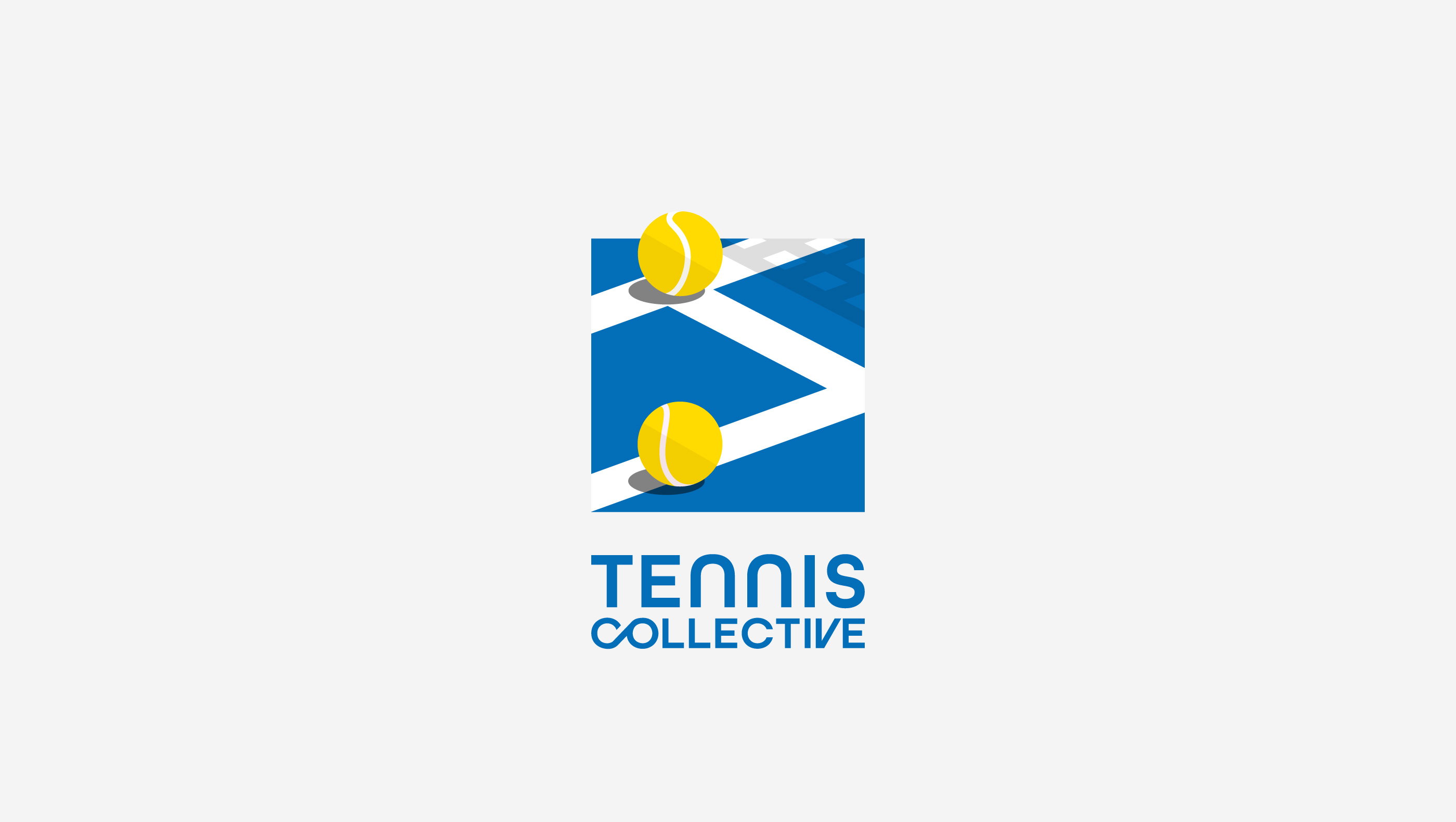
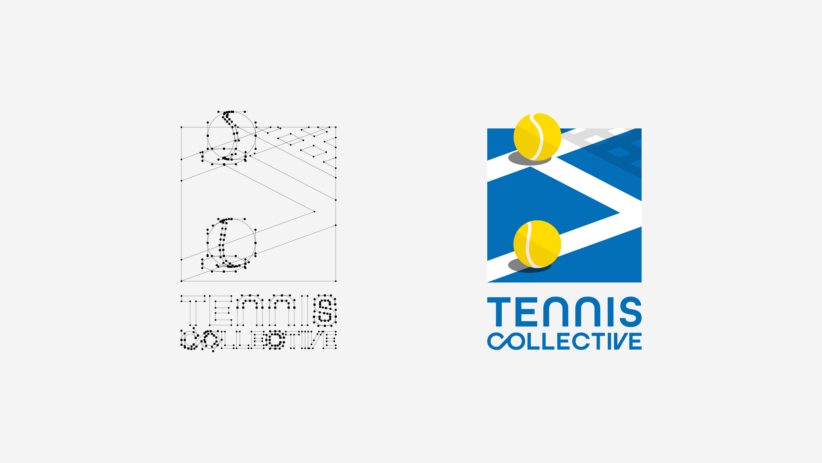
ロゴは、単なるシンボルを超え、アプリが提供する体験そのものを象徴しています。テニスコートを抽象化した幾何学的なラインと、そこに配置された二つのテニスボールをモチーフとすることで、テニスにおける「繋がり」と「成長」という二つの核心的な価値を表現しました。この交錯するコートラインは、アプリを通じてプレイヤー同士が交流し、情報が共有され、強固なコミュニティが形成される様子を視覚的に示唆しています。また、躍動感のあるテニスボールは、プレイヤー一人ひとりのスキルアップへの意欲や、目標達成に向けた継続的な「成長」の道のりを表現しており、アプリがユーザーのテニスライフを豊かにするサポートツールであることを示唆しています。
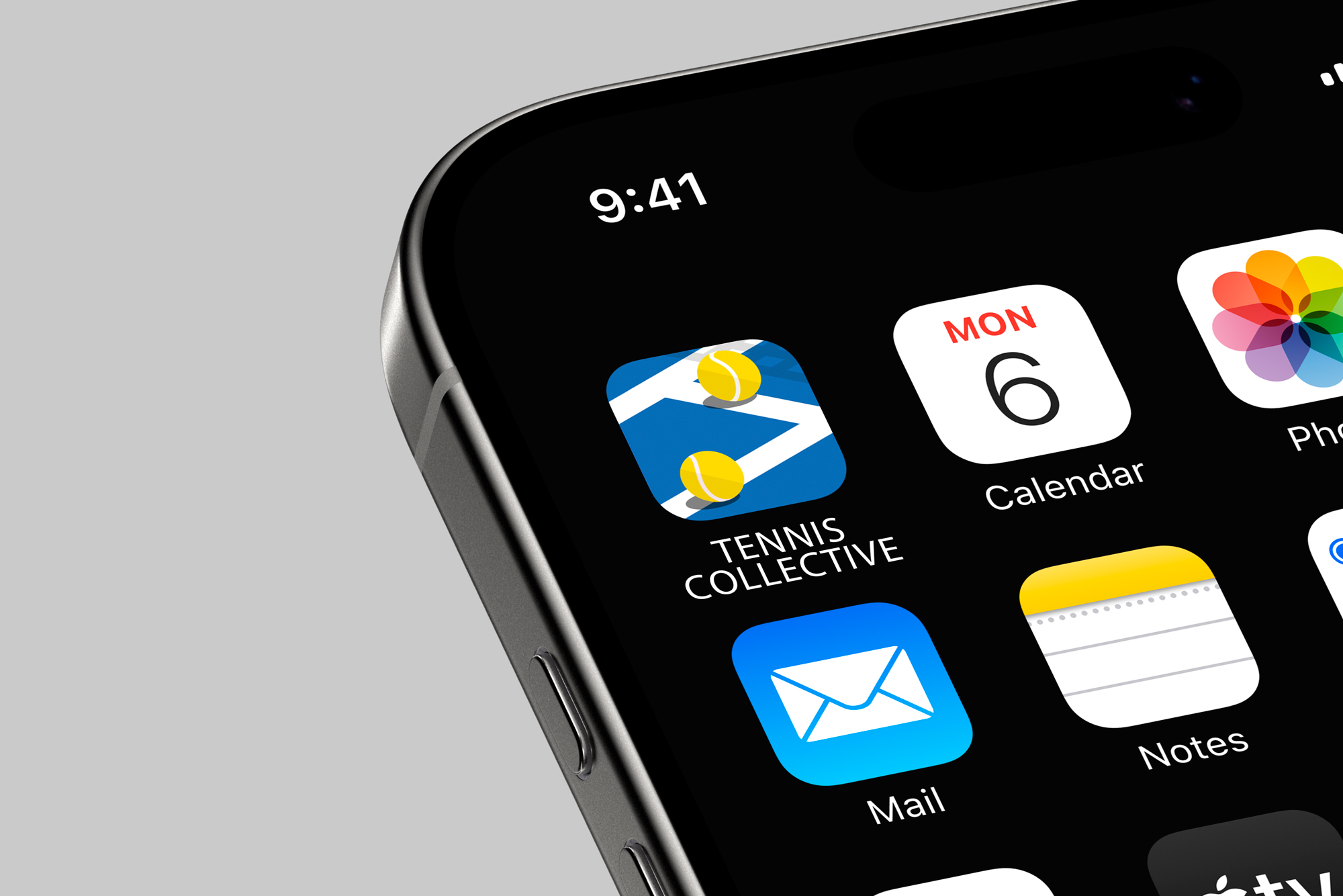
デザインにあたっては、モバイルアプリのアイコンとしての機能性を最重要視し、どのような環境下でも瞬時に「テニス」と「コミュニティ」を連想させる、極めてシンプルで高い視認性を持つ構成を採用しました。色彩計画においては、テニスコートを彷彿とさせる鮮やかな青と清潔感のある白を基調とし、そこにテニスボールの象徴的な黄色をアクセントとして加えることで、清潔感とスポーティーな印象を両立させています。この抽象化されたテニスコートのデザインは、普遍性と現代性を兼ね備え、テニスを愛する幅広い層の人々に受け入れられる洗練されたブランドイメージを構築します。
「テニスを通じて人々が繋がり、共に成長する開かれたコミュニティ」という明確なビジョンを視覚的に具現化する強力なブランドコアとして機能します。シンプルでありながらも深い意味合いを持つこのアイコンとロゴは、モバイルアプリの入り口として、またブランド全体のシンボルとして、ユーザーに一貫した、記憶に残るブランド体験を提供することに貢献しています。
ロゴは、単なるシンボルを超え、アプリが提供する体験そのものを象徴しています。テニスコートを抽象化した幾何学的なラインと、そこに配置された二つのテニスボールをモチーフとすることで、テニスにおける「繋がり」と「成長」という二つの核心的な価値を表現しました。この交錯するコートラインは、アプリを通じてプレイヤー同士が交流し、情報が共有され、強固なコミュニティが形成される様子を視覚的に示唆しています。また、躍動感のあるテニスボールは、プレイヤー一人ひとりのスキルアップへの意欲や、目標達成に向けた継続的な「成長」の道のりを表現しており、アプリがユーザーのテニスライフを豊かにするサポートツールであることを示唆しています。
デザインにあたっては、モバイルアプリのアイコンとしての機能性を最重要視し、どのような環境下でも瞬時に「テニス」と「コミュニティ」を連想させる、極めてシンプルで高い視認性を持つ構成を採用しました。色彩計画においては、テニスコートを彷彿とさせる鮮やかな青と清潔感のある白を基調とし、そこにテニスボールの象徴的な黄色をアクセントとして加えることで、清潔感とスポーティーな印象を両立させています。この抽象化されたテニスコートのデザインは、普遍性と現代性を兼ね備え、テニスを愛する幅広い層の人々に受け入れられる洗練されたブランドイメージを構築します。
「テニスを通じて人々が繋がり、共に成長する開かれたコミュニティ」という明確なビジョンを視覚的に具現化する強力なブランドコアとして機能します。シンプルでありながらも深い意味合いを持つこのアイコンとロゴは、モバイルアプリの入り口として、またブランド全体のシンボルとして、ユーザーに一貫した、記憶に残るブランド体験を提供することに貢献しています。
This project involved the creation of the brand-defining icon and logo design for a mobile application aimed at tennis enthusiasts. Our goal was to visually convey the inherent joy of tennis and the value of "connection" fostered by a community, thereby building a brand image that inspires both familiarity and trust among users.
The logo transcends a mere symbol; it embodies the very experience the app offers. By utilizing the abstract geometric lines of a tennis court and two strategically placed tennis balls as motifs, we expressed the two core values of "connection" and "growth" in tennis. The intersecting court lines visually suggest how players interact, share information, and form a robust community through the app. Furthermore, the dynamic tennis balls represent each player's ambition for skill improvement and their continuous "growth" journey towards achieving goals, indicating that the app serves as a supportive tool to enrich users' tennis lives.
In designing this, we prioritized the functionality as a mobile app icon, adopting an extremely simple and highly visible composition that instantly evokes "tennis" and "community" in any environment. For the color scheme, we based it on vibrant blue, reminiscent of a tennis court, and clean white, adding the iconic yellow of a tennis ball as an accent to achieve both freshness and a sporty impression. This abstract design of a tennis court combines universality with modernity, constructing a sophisticated brand image that will be embraced by a wide range of tennis lovers.
This design functions as a powerful brand core that visually embodies the clear vision of "an open community where people connect and grow together through tennis." Simple yet profound, this icon and logo, serving as the gateway to the mobile app and the overall brand symbol, contribute to providing users with a consistent and memorable brand experience.