
BD Construction Company
ロゴマークは、「未来を築く確かな技術と信頼」というブランドの核を力強く表現しています。
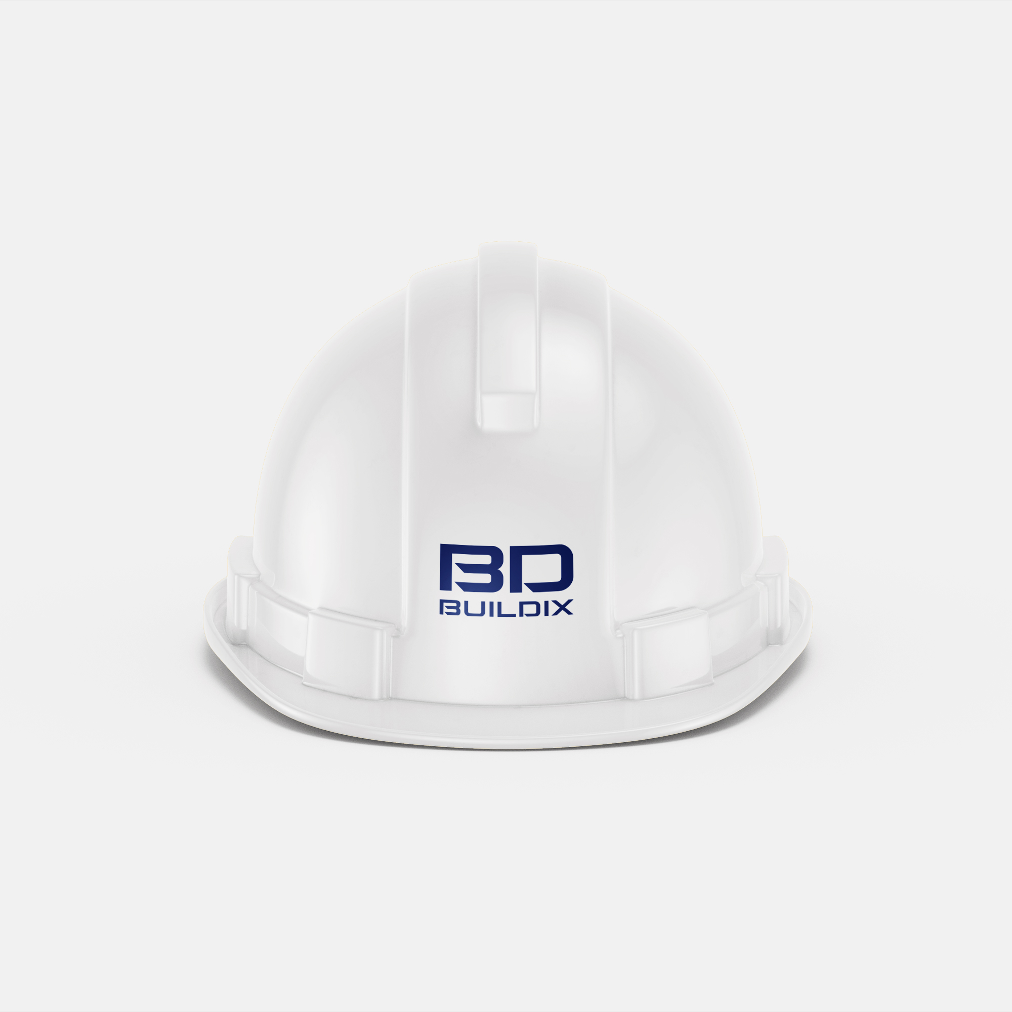
メインシンボルである「BD」は、社名の頭文字であると同時に、家屋やビルを思わせる安定感のある骨格を形成。力強く、そして洗練されたフォルムは建築物の堅牢さと、未来を見据える先進性を象徴しています。
特に「B」の内部のシャープなラインと、「D」の開かれた空間は、伝統的な技術への敬意と、常に新しい価値を創造し続ける開拓者精神を表しています。また、全体的に直線的でありながらもバランスの取れたデザインは、綿密な計画に基づいた確実な施工と、クライアントの多様なニーズに応える柔軟性を表しています。
ロゴタイプは、ロゴシンボルと調和するモダンで視認性の高いフォントを選定。企業としての信頼性と専門性を際立たせ、見る人に安心感を与えます。
このロゴマークは、時代や歴史を意図して感じさせないように設計されており、一般的な建設会社ではなく、お客様の夢や未来を具現化するパートナーであることを示唆しています。確かな技術力と、時代を切り拓くイノベーションへの挑戦を通じて、社会に貢献し続ける新しい企業姿勢を表現しています。
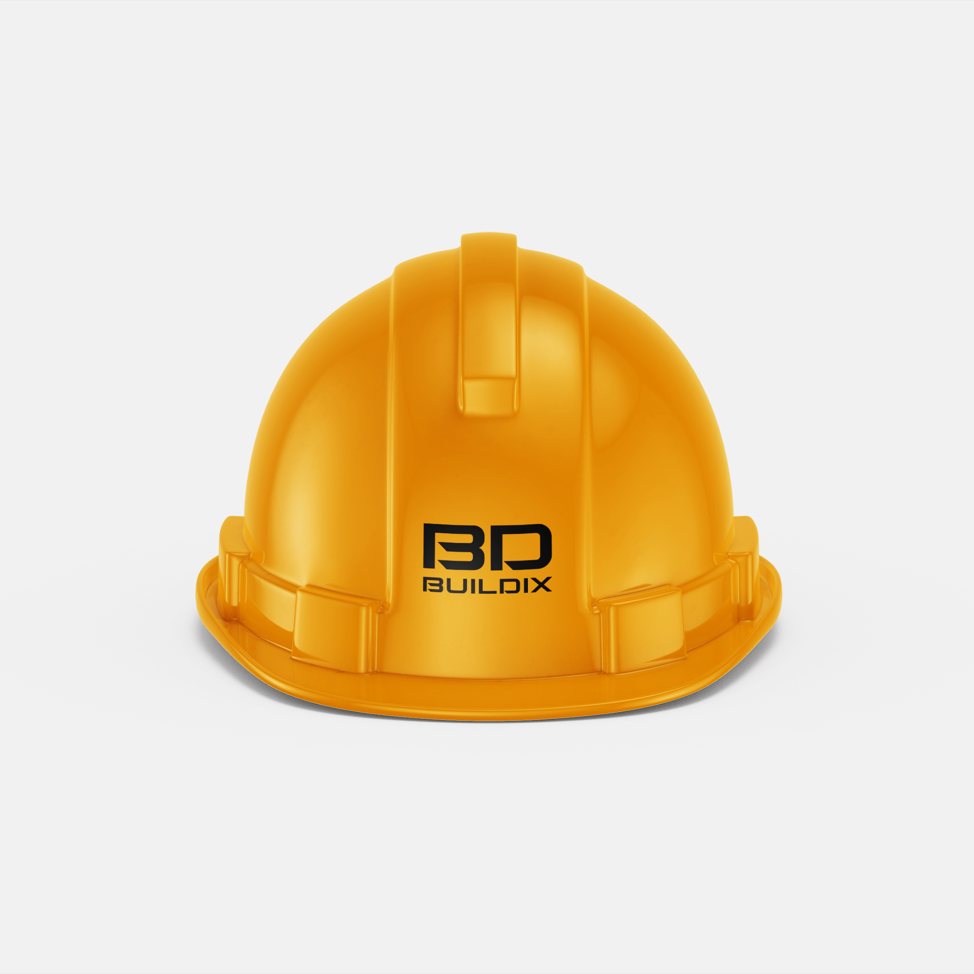
The logo mark powerfully expresses the core of the brand, "reliable technology and trust that builds the future.
The main symbol, “BD,” is not only the initial letter of the company name, but also forms a stable framework reminiscent of a house or building. The strong yet refined form symbolizes the robustness of the architecture and the forward-looking, forward-looking nature of the brand.
In particular, the sharp lines of the interior of “B” and the open space of “D” express respect for traditional techniques and a pioneering spirit that constantly creates new values. In addition, the overall linear yet balanced design represents reliable construction based on careful planning and flexibility to meet the diverse needs of the client.
For the logotype, a modern, highly legible font was selected that harmonizes with the logo symbol. It highlights the company's reliability and professionalism, giving the viewer a sense of security.
The logotype is designed to be intentionally timeless and history-neutral, suggesting that we are not just a construction company, but a partner in realizing the dreams and futures of our clients. It expresses our corporate stance of continuing to contribute to society through our solid technical capabilities and the challenge of innovation that pioneers the times.