
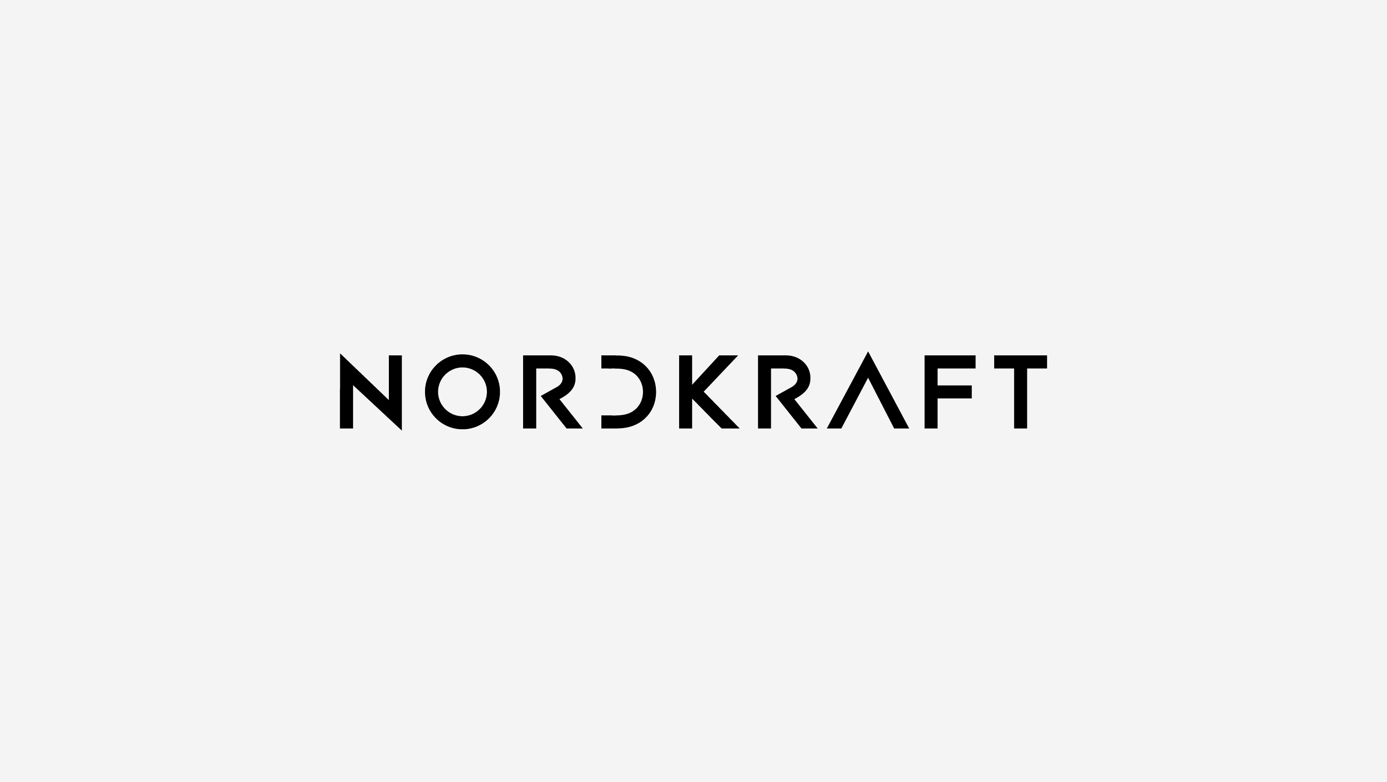
NORDKRAFT
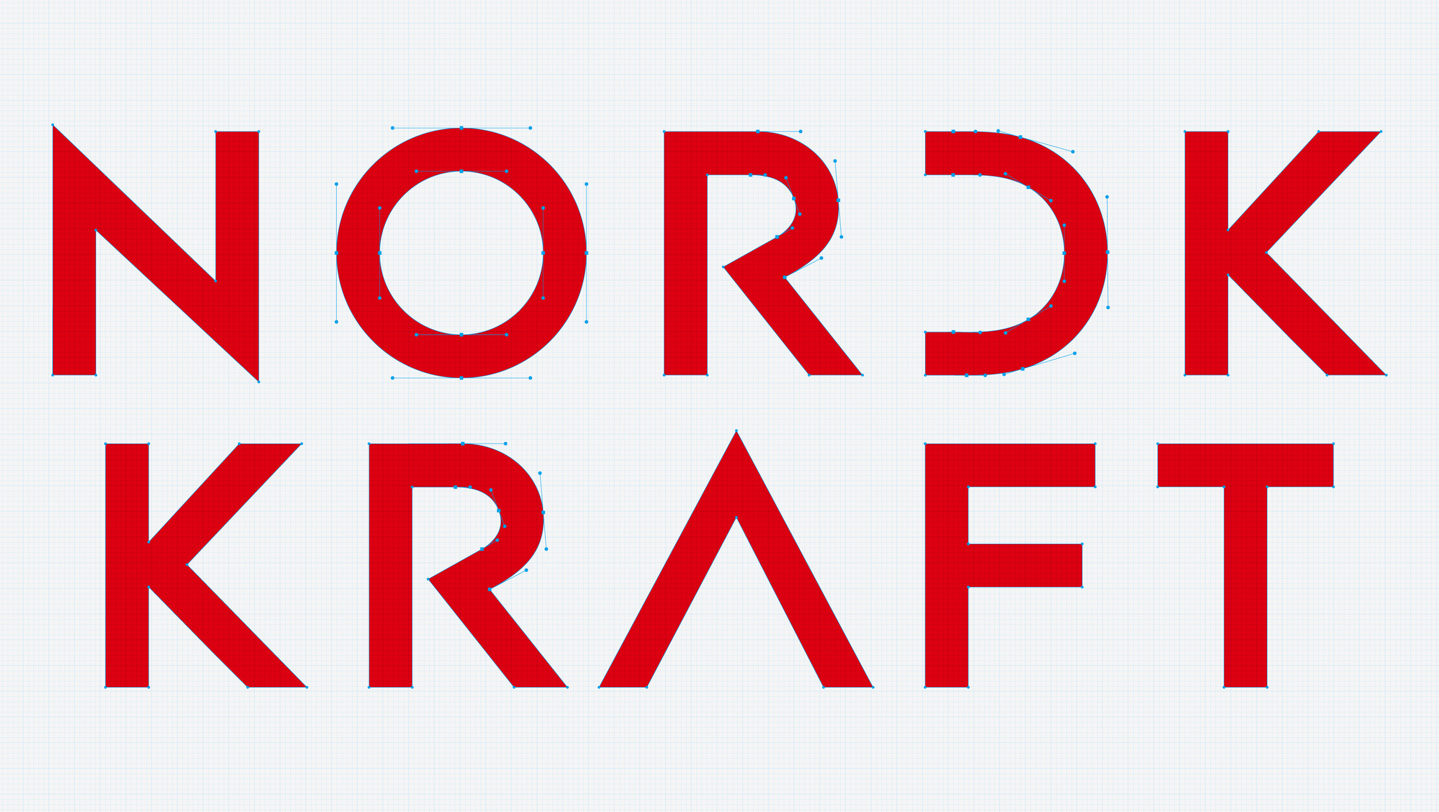
ロゴは、直線と幾何学的な曲線を用いた構成的なタイポグラフィが特徴です。硬質でありながらも洗練された印象を持ち、北欧的な機能美とクラフトマンシップを想起させます。省略された「D」や、構造的に組まれた「R」「A」などの文字処理は、視覚的な違和感と美しさの均衡を生み、見る者の記憶に残ります。国境を越えて通用する普遍性と、ブランドの力強さを象徴するロゴデザインです。
“Constructed Balance — Typography Inspired by Nordic Rationality.”
The logo features a geometric typographic structure, blending sharp angles with bold curves.
Its refined, industrial aesthetic evokes Scandinavian design principles and craftsmanship.
Elements like the mirrored “D” and the architectonic forms of letters such as “K” and “A” introduce a sense of visual tension and memorability.
This logo conveys strength, clarity, and universality—essential qualities for a brand bridging global markets.