Financial And Management Support Company
未来を拓く羅針盤
財務・経営支援を軸に活動する企業のブランドアイデンティティを視覚的に表現しています。左側のエレメント(ロゴマーク)は、安定と信頼を象徴する「V」の字を基調とし、未来への開かれた視野と成長の可能性をグラデーションで表現しています。深いブルーから鮮やかなスカイブルーへの変化は、企業の専門性と革新性、そして顧客のビジネスを新たな高みへ導くダイナミズムを示唆します。
ロゴタイプは、力強くも幾何学的に洗練された書体としてデザインされ、事業の根幹である「先見性」と「実効性」を明確に打ち出しています。特に、スラッシュで区切られたようなNのデザインは、「行間を読む」というコンセプトから課題解決への明晰なアプローチと、未来を切り開く鋭い洞察力を象徴しています。
全体として、このロゴは、単なる支援に留まらない、顧客の未来を共に創造し、導いていくパートナーシップの姿勢を力強く示しています。ビジネスの羅針盤となり、成長と成功への道を照らす、そんな企業理念が込められたデザインです。
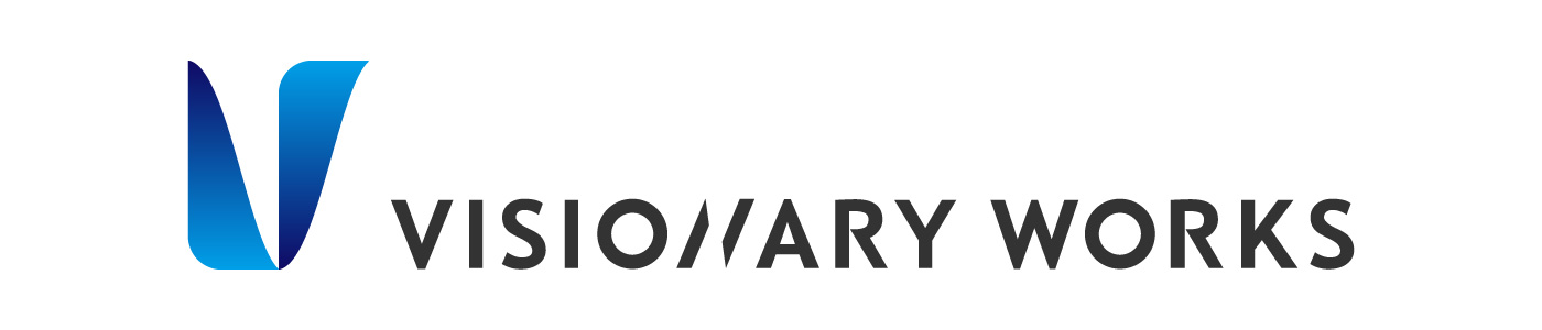
Concept: A Compass Guiding Towards the Future
This logo visually expresses the brand identity of a company specializing in financial and management consulting.
The logomark is based on the letter "V," symbolizing stability and trust, with a gradient representing an open vision towards the future and the potential for growth. The transition from deep blue to vibrant sky blue suggests the company's expertise and innovation, as well as the dynamism to guide clients' businesses to new heights.
The logotype is designed with a strong yet geometrically refined typeface, clearly highlighting the core values of "foresight" and "effectiveness" essential to their business. Notably, the "N" design, resembling a slash, symbolizes a clear approach to problem-solving, drawing from the concept of "reading between the lines," and a sharp insight for pioneering the future.
Overall, this logo powerfully conveys a partnership approach that goes beyond mere support, co-creating and guiding clients' futures. It is a design imbued with the company's philosophy of becoming a business compass, illuminating the path to growth and success.