Beauty & Wellness Lifestyle Salon Company
本質を照らし、輝きを導く
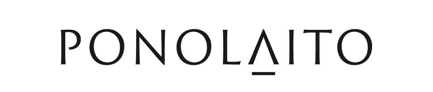
このロゴデザインは、Beauty & Wellness Lifestyle Salon Companyとして多岐にわたる事業を展開される企業の理念を視覚的に表現しています。社名に込められた「ありのまま」「本来の」といった意味合いと、スポットライトで「輝きを導く」という想いを基盤に、デザインを構築しました。
私たちは、お客様一人ひとりが持つ本質的な美しさ、健康、個性に光を当て、それを最大限に輝かせたいという哲学をデザインに落とし込んでいます。
ロゴタイプは、ミニマルでありながらも洗練されたサンセリフ書体を採用し、それをベースにデザイン。プロフェッショナルな信頼感と普遍的な美しさを表現しています。特に、キーワードとなる「光を当てる」という要素を、特定の文字の造形に象徴的に組み込みました。具体的には、大文字の「A」の中央部分を、上から光が差し込むような形状にアレンジすることで、スポットライトが本質を照らし出す様子を抽象的に表現しています。このユニークな書体デザインは、視覚的なアクセントとなると同時に、ブランドの核となる価値を直感的に伝えます。文字間のスペース(カーニング)は、視認性とバランスを最大限に考慮し、安定感のある佇まいを目指しました。
色彩は、ダークグレーを採用。落ち着きのある上品なダークトーンが、幅広い事業領域と多様な顧客層に対応できる柔軟性と、時代に左右されない普遍性を表現しています。単色での使用を基本とし、様々な媒体での展開に対応できるよう汎用性の高いデザインとしました。企業理念を、シンプルかつ力強く象徴するデザインです。
lluminating Essence, Guiding Radiance
This logo design visually represents the philosophy of a Beauty & Wellness Lifestyle Salon Company, reflecting the diverse range of businesses it operates. The design is built upon the company name's meaning of "as is" or "inherent," combined with the desire to "guide radiance" through a spotlight.
We've embedded into the design our philosophy of shining a light on each customer's essential beauty, health, and individuality, helping them radiate to their fullest potential.
The logotype employs a minimal yet sophisticated sans-serif typeface, conveying professional reliability and timeless beauty. Specifically, we've symbolically integrated the key element of "shining a light" into the form of certain letters. The central part of the uppercase "A" is abstractly rendered to resemble light shining down from above, illustrating a spotlight illuminating one's essence. This unique typeface design serves as a visual accent while intuitively communicating the brand's core values. The kerning (spacing between letters) has been meticulously adjusted for maximum legibility and balance, aiming for a stable and poised appearance.
For color, we've chosen dark gray. This calm and elegant dark tone expresses the flexibility to cater to a wide range of business areas and diverse customer segments, as well as a timeless universality unaffected by trends. Primarily used in a single color, the design is highly versatile to ensure adaptability across various media. It's a simple yet powerful design that symbolizes the company's philosophy.